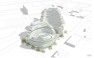
stumbling upon this competition project by standard architecture for a visionary competition caught my eye for two reasons:
its design ethos; food as a tool supporting community,
and its diagrams; the clarity and style are good examples of style and content, both informative and artistic.


there sections were provocative as well... a series of terracing platforms that overlap and float among thin vertical structures. these sensibilities are something we're attempting to work into our upcoming competition.


check out the interview posted at archdaily_ standard partners - jefferey allbrook and silvia kuhle - speak on their philosophy, innovation, the role of technology in architecture, networking, and running their practice.
AD Interviews: Standard from ArchDaily on Vimeo.
receiving an honorable mention from the Re:Vision Dallas competition. its design is inspired by the cliff dwellings of the anasazi. food gardens bring the community of 1,000 residents together and provides an alternative form of income when good harvests abound.
"Standard’s radical approach focused on how the residents could potentially gain equity through participation in construction, agricultural, maintenance, education and conservation programs central to the sustenance of the community." [archdaily]

The practice was founded in 1996 by Jeffrey Allsbrook (M Arch USC, studies at the at the Städelschule in Frankurt, Germany and at the Berlage Institute in Amsterdam) and Silvia Kuhle (Architect Technische Universität Darmstadt, Germany, M Arch Columbia University).
"standard is developing an outstanding body of contemporary work that pursues an aesthetic of minimal clarity with designs that transform their settings" says the LA based architecture firm. they've completed a number of projects for a variety of clients in many places nationally and internationally. check out more of their work at standard architecture
here were a few that caught my eye after a quick cruise.
wildflower centre: i enjoyed their wildflower centre project. it reminded me of a thesis given last year at our school.
tree house: their tree house has a seductive ribbon of wood blending into a mass of concrete.
m1: m1 looks like a sleek rehab of an old warehouse space.

No comments:
Post a Comment