So i'm back in France for those who do not know already....working on another project with THEVERYMANY. This will be my last structure before I leave for LA. Its probably another reason for the active posting recently, traveling gives me some time to think and blog I guess...
here is a time lapse I threw together; make sure to check out the website as well for updates on the build/whats going on. THEVERMANY.COM
thank you all for the support and encouragement. Hopefully after I finish my masters Nick, Jessie, and I will make something amazing out of our experiences.
#thoughts:
I quickly realize that being "responsible" was more complicated then simply telling people what to do. I have to adapt to different situations/fields, work out difficult problems, teach, manage, maintain public relations, relaying messages and keep a straight face in moments of panic. I can't say i've done a great job, but I can say i'm happy with how its going, and Frac/Students have been so helpful to me. I'm glad I get to share this experience with them.
Friday, May 13, 2011

Monday, May 9, 2011
Tvmny, Wins competition:
#of course this comes with realizations....
http://theverymany.com/work-in-progress/11-la-redondo-beach/
After looking at that link, I guess you can say at this very moment I leveled up my digital skills. I learned how to model differently in Rhino, Python, and alittle bit of zaha theory (which I can't say i'm proud of...)
:after all is done and over with I realize how afraid the public truly is of architecture...but not just the dynamics or ideas presented but also how others will affect it or be affected by it! so, friends....how do we Intend fix this? how do we win back the trust of the world? to prove not only to the public but ourselves that we are not only necessary but an important function to the expansion of the human mentality.
Thursday, May 5, 2011
Mobile thought.
Literary...
What separates the men from the boys. Managing my first project in Orleans I gotta say "holy crap this is alot of work." I start to wonder if I'm really cut out for this type of work....(I'm not, but who is?) I can't honestly say "Hey! I always wanted this!"
I've always been more of the laid back "lets design" for fun kind of guy......
But in the end this is reality, this project was been a large part of my life in NYC. If I don't see it through who will?
heres a link for the project in Orleans.
Thoughts: its a idea about structure to surface, in the end YES it does look like the other projects and YES he has done something similar before (TVMNY semi official age maybe 2?). BUT, look a little deeper....think about the construction of the pieces, and how it comes together. The fact that a small 4x5x1.5 box can make a 30' long 20' wide and 14' tall structure is amazing..... right? no? are you not impressed? then these designs are not for you! :P and that only scratches the surface....theres so much more depth to the process....
I'll post my own pics in a month.
please remind me......
Saturday, April 2, 2011
The Art of Unemployment 3: Georges Bataille and a Night of Excess
The Art of Unemployment 3: Georges Bataille and a Night of Excess
This piece in the series is a party invitation. In keeping with the series material process themes, this work made me learn a new crocheting stitch and required the leisure time to create several hand-made objects in a smaller time frame. The party was themed on the thought-work of George Bataille: that of excess, of destruction and the joys of debt and not being sober or entirely 'civil'. The piece itself was a meditation on his philosophy. Why have an invitation that was readable at will? To get the party information, one had to destroy the structure of the invitation and pull it apart in order to get at the most important part: the tumor, or excess, of the sphere.
The information itself called for black-tie and insinuated bringing costly and overly extravagant food and drink. Get down with Bataille. And drink, dress, smoke, feed and sex yourself into oblivion.


This piece in the series is a party invitation. In keeping with the series material process themes, this work made me learn a new crocheting stitch and required the leisure time to create several hand-made objects in a smaller time frame. The party was themed on the thought-work of George Bataille: that of excess, of destruction and the joys of debt and not being sober or entirely 'civil'. The piece itself was a meditation on his philosophy. Why have an invitation that was readable at will? To get the party information, one had to destroy the structure of the invitation and pull it apart in order to get at the most important part: the tumor, or excess, of the sphere.
The information itself called for black-tie and insinuated bringing costly and overly extravagant food and drink. Get down with Bataille. And drink, dress, smoke, feed and sex yourself into oblivion.


Art of Unemployment 2: interactive portrait

This multi-media piece is the second in my art of unemployment series. Just like the first, it showcases over-worked detail/structure and material process that comes from environments one may only frequent when at leisure. The flowers were pressed weeks before the idea came about.
This piece is a birthday "card" for a dear friend. Our faces on the caterpillars' bodies are laminated and Velcro-ed to be changed with the users mood and at the users leisure. The faces come in angry, stoic, happy, kissy and pensive. mix and match is encouraged.
Tuesday, March 29, 2011


Tuesday, December 28, 2010
shade in chicago
"Shade is the launch of a new, self-developed material that applies as a film to glass surfaces, which through blocking and passing daylight forms a spacial projection of shadows and sunlight. The film holds a grid of triangles that each individually fade between transparent and opaque, and hence block or pass light. The graphic shadows projected on the floor, walls and ceiling of the space reveal the geometrical wind patterns that pass the building on the other side of the glass, as choreographed by the measurements of an outdoor sensor.
As the angle of light and patterns of wind are continuously changing throughout the day and year, the perpetual character of the artificial space is reconnected with an evolving, unplanned natural timeline."


check out dezeen or vimeo for an epic clip
Tuesday, December 14, 2010
'high tech pavilion'_ animation

   |
tubes of light span a mirrored void projecting them into infinity. a short, 50 second animation was created through rhino, 3ds max, and adobe after effects.
Friday, December 3, 2010
The Making of a Portfolio
So, as I begin my final days in posting portfolios by mail towards their fateful destinations, I am relieved at the long (although fun) process of Making being over. I decided to save a bit of money (probably only a bit) and add some class to my portfolios by doing a perfect binding in watercolor paper. The reasons for this were mostly having an A4+ document perfect bound in the city of MKE is quite the task. No one can bind that size easily, and wanted me to have large-scale prints done to create the cover in addition to printing my book-masterpiece. No thank you hundreds and hundreds of dollars that I would (and will) otherwise be using to apply to the schools in the first place. The final product? 49 full color, 70# matte cover stock A4 images, bound with a hand worked Japanese stab process and an ink-solvent transfer that is reminiscent of etching. Cost? >$40 per set of original prints plus cutting, about $6 for 3 sheets of large format heavy Watercolor Paper, $6 for a Fiskers 1/16th hole punch, about $4 for a few Chartpak markers and about $5 for cover images prints. HAHA Kinkos.
So, I've been asked to share the process of binding and covering. here is goes:
Intro: I should begin by saying that my prints were A4 front and back, but I had the printer guy cut the inner edge (what will be in the binding) about 1/4" wider than the crop mark, this is so my images do not get lost in the binding as you will see.
The Binding:

1. organize and double triple check that your copies are in order. I had them printed frontside and backside in reading order. I.e. when you flip the first page over you are looking at a full spread.


2. Prepare your template for punching holes. I cut a piece of cardboard the same width as my portfolio pages and drew a line 1/4" from the edge (you will remember the 1/4" allowance I requested when I had the pages cut). Then, I made a second line at 1/8". I marked an ODD number of dots along this center line with regularity. ( I made 11 at about 3/4" between, getting closer to the corners on either end). The ODD number is important as I followed the instructions on Japanese Stab Binding from the following video: japanese stab binding But I did more holes, closer together so that it would be very strong. Then, proceed to punch your holes, using each mark as the approximate center. Just be careful, it need not be entirely perfect (just as close as you can get).


3. Use your template on the top of your first set of pages where the binding would go. Use binder clips to secure if necessary, or just hold it steady. Use a sharp pencil to mark where each hole will go. Next, stack a few pages together in order (the thicker the paper, the less you can do at once). This is where binder clips are important. you want the pages to move as little as possible. While punching, the blade could be a bit dull an push the pages slightly askew. Clipping your pages before you punch will minimize this. Punch punch punch away!
4. When stitching/binding the pages, I used a decent weighted thread, but one that is a simple sewing thread. Make sure it is a type which could be used for sewing fabrics. Drugstore sewing-kit thread works, but it is not as strong as those bought from a fabric store. Again, I used the tutorial on Japanese Stab Binding.
The Cover:


5. Make the cover by cutting it the height of your portfolio and twice the length plus the width of the binding. I also found that adding an extra scant 1/16" will aide in making everything line up at the end (after folding). Mark the binding limits with lines along the paper. On the other side, mark another set of lines that are 1/4" farther out from the middle than each binding limit.


6. Make folds towards each other on the lines that mark the binding. On the opposite side, fold outwards the lines which mark the 1/4" limit. The result should look like that above. You can start envisioning it as a perfect binding.
The Transfer:

7. I will not go over the transfer in detail as one could use another method (like large format printing) to make the cover itself. But, to make a transfer, you have to print out a mirror-image of what you want on a non-home office printer (or, you could print it on your home computer and use a Xerox machine to make the necessary print). You turn this face down on your receiving paper (the cover, in this case) and rub an ink solvent on the back. These can be toxic, but not hard to find: Chartpak brand illustration markers carry a "Blender Marker" which has the necessary elements. Rub, Rub, Rub and you get a nice effect on the cover.
Adhering:


8: Before adhering the cover to the binding, be sure to really crease each fold so that everything will stick properly. As far s glue goes, I used plain old xtra-sticky Rubber Cement. it really is magic. Really lay in on the inside of the cover binding, and ALSO on the edge and sides over your bound/sewn pages. Wait until they have dried fairly completely (this is how it is permanent). then, CAREFULLY place the booklet into its cover. A good way to really fine tune the lining up is to pack it (yes like a cigarette) on a table top. First on the bottom, then on the binding itself, the top, or how you feel it needs adjusting. Rub the binding as well to encourage the bond. After a moment, open the cover and crease the fold again. It should cover the thread and the binding. This method is really pretty permanent and if it isn't, you can usually find a way to adjust it. If you are nervous, make a couple extra covers to insure you can always fix an emergency!
9: Send out your portfolios and drink some well-deserved whiskey cocktails. Horray! You have made it into a grad program because of your excellent and thrifty portfolio making. GoodBye MKE!
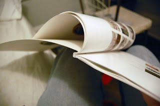
So, I've been asked to share the process of binding and covering. here is goes:
Intro: I should begin by saying that my prints were A4 front and back, but I had the printer guy cut the inner edge (what will be in the binding) about 1/4" wider than the crop mark, this is so my images do not get lost in the binding as you will see.
The Binding:

1. organize and double triple check that your copies are in order. I had them printed frontside and backside in reading order. I.e. when you flip the first page over you are looking at a full spread.


2. Prepare your template for punching holes. I cut a piece of cardboard the same width as my portfolio pages and drew a line 1/4" from the edge (you will remember the 1/4" allowance I requested when I had the pages cut). Then, I made a second line at 1/8". I marked an ODD number of dots along this center line with regularity. ( I made 11 at about 3/4" between, getting closer to the corners on either end). The ODD number is important as I followed the instructions on Japanese Stab Binding from the following video: japanese stab binding But I did more holes, closer together so that it would be very strong. Then, proceed to punch your holes, using each mark as the approximate center. Just be careful, it need not be entirely perfect (just as close as you can get).


3. Use your template on the top of your first set of pages where the binding would go. Use binder clips to secure if necessary, or just hold it steady. Use a sharp pencil to mark where each hole will go. Next, stack a few pages together in order (the thicker the paper, the less you can do at once). This is where binder clips are important. you want the pages to move as little as possible. While punching, the blade could be a bit dull an push the pages slightly askew. Clipping your pages before you punch will minimize this. Punch punch punch away!
4. When stitching/binding the pages, I used a decent weighted thread, but one that is a simple sewing thread. Make sure it is a type which could be used for sewing fabrics. Drugstore sewing-kit thread works, but it is not as strong as those bought from a fabric store. Again, I used the tutorial on Japanese Stab Binding.
The Cover:


5. Make the cover by cutting it the height of your portfolio and twice the length plus the width of the binding. I also found that adding an extra scant 1/16" will aide in making everything line up at the end (after folding). Mark the binding limits with lines along the paper. On the other side, mark another set of lines that are 1/4" farther out from the middle than each binding limit.


6. Make folds towards each other on the lines that mark the binding. On the opposite side, fold outwards the lines which mark the 1/4" limit. The result should look like that above. You can start envisioning it as a perfect binding.
The Transfer:

7. I will not go over the transfer in detail as one could use another method (like large format printing) to make the cover itself. But, to make a transfer, you have to print out a mirror-image of what you want on a non-home office printer (or, you could print it on your home computer and use a Xerox machine to make the necessary print). You turn this face down on your receiving paper (the cover, in this case) and rub an ink solvent on the back. These can be toxic, but not hard to find: Chartpak brand illustration markers carry a "Blender Marker" which has the necessary elements. Rub, Rub, Rub and you get a nice effect on the cover.
Adhering:


8: Before adhering the cover to the binding, be sure to really crease each fold so that everything will stick properly. As far s glue goes, I used plain old xtra-sticky Rubber Cement. it really is magic. Really lay in on the inside of the cover binding, and ALSO on the edge and sides over your bound/sewn pages. Wait until they have dried fairly completely (this is how it is permanent). then, CAREFULLY place the booklet into its cover. A good way to really fine tune the lining up is to pack it (yes like a cigarette) on a table top. First on the bottom, then on the binding itself, the top, or how you feel it needs adjusting. Rub the binding as well to encourage the bond. After a moment, open the cover and crease the fold again. It should cover the thread and the binding. This method is really pretty permanent and if it isn't, you can usually find a way to adjust it. If you are nervous, make a couple extra covers to insure you can always fix an emergency!
9: Send out your portfolios and drink some well-deserved whiskey cocktails. Horray! You have made it into a grad program because of your excellent and thrifty portfolio making. GoodBye MKE!

Thursday, December 2, 2010
the airlab is coming...


my modeling skills are still archaic at best. but behold - the start of something beautiful.... i hope.
Wednesday, November 10, 2010
HERC: sculpture + short list
i was invited to join a competition team as a design consultant/catalyst.
a group of five [including my self] hammered out a charrette in just one night [more or less].

summer
the prompt was to re-develop a neglected piece of property at a jewish community center. the program outline called for a sculptural anchor.
our design re-interprets the idea of sculpture to include the landscape.
more insight to come.... i needed to post the images asap.

winter
oh, by the way. we were short listed. finalists. no biggie. the comp ran out of steam however, kind of sad, but i've heard insider information that is rather disturbing regarding the dissolution of the competition....
design team [studio 400]:
j.cordell steinmetz
natalie dulka
alex harm
eric barch
Friday, November 5, 2010
lebbeus woods; light pavilion
.JPG)
the fabrication technique
i'm learning a brand new set of skills; rhino, 3ds max, and grasshopper... about time.
we are to pick a building to study, model, love and hate. the goal by the end of the semester is to create a 60 second animation of the project.
my project was spurred on by my studio professor. he's working with lebbeus woods and steven holl on the raffles city project in chengdu, china. so.... i'm modeling lebbeus woods' high-tech [light] pavilion. it's a series of aggressively angled light shafts surrounding stairs and platforms. the surfaces are all mirrored, conveying a sense of infinity and ambiguity.
the modeling is coming slowly, but i wanted to share some progress of the physical model i need to produce.
it's the start of a 1/2" = 1" scaled model of the light tube. the photos show the jig used to create the bevelled corners as well as some of the products of the acrylic heating and forming.

the jig

the result
i'll post the images of the project when/if i get permission. big names and the work hasn't been built, so i hear things are a little shaky. i'd hate to be the one to spill the beans and end my career before it begins.
b4; timelapse ii
so far.
frame:
1 x 2's + mdf
topo:
1/8" cardboard
context:
3/32" chipboard [yeah, i know, wtf were we thinking]
application:
gesso
pigments + india ink
acrylic
tissue paper
cheese cloth
newspaper
pigments
beeswax
pigments
fire
more, i'm sure to be applied
my fingers are still gray/black from the last night's marathon rally
Thursday, November 4, 2010
augmented sculpture
epic!
Augmented Sculpture by GROSSE 8 & LICHTFRONT / Passagen 2010 from Lichtfront on Vimeo.
thanks ian!
Tuesday, November 2, 2010
b4; timelapse
for brief 4 @ gsapp we're charged with designing a climatology lab for a group of 10 scientists and a whole host of spaces for public interaction. the site is in the shadow of the brooklyn bridge near pier 17 on the old peck slip. it's offering up untold treasures of texture, context, potential and inspiration. hard edges, long shadows, people milling about everywhere, rusted metal, driftwood, more more more to come.
ps. great job everyone. it's going to look killer. updates to come...
Thursday, October 21, 2010


Monday, October 18, 2010

Sunday, October 17, 2010
the GREat rant.

[found as image when searching "GRE criticism." Apropos.]
I am also bitter. Check out the deep-sea news blog's post on the GRE and you will too. Is nothing sacred from becoming a corporation any longer? Or is the corporation now sacred. But I am not just bitter from my feeling of being used by corporations like this, or that the GRE is antiquated and unsuccessful in doing what it claims, but becasue educational institutions, both public and private, while knowing all of these things, still require it. And while New York State took steps to regulate their practices in their public primary schools, they still subject their students to do them, and their places of higher learning require the test for admission. Not all states, programs, or schools do, but most. And why? And if certain schools use the scores to toss out a percentage of applicants before looking over any further information about the applicant, are they not necessarily throwing out a student who could bring honor and achievement to the school? The answer is yes. What is education anymore? And how are we measured by it and for it?
I feel this is my least intellectual posting, but it is one that houses some deep-seeded frustrations. Further to come, is a brief analysis on class-status and the ability to not just perform on the test, but to take it at all.
Thursday, October 14, 2010
[presenting]
many of you may know about the little endevour i got myself into for about a year before i left the third coast and sojourned to the east coast:
i now proudly present: studio deep end.
we're off an running - have been for some time - the group is set, the build out works, and the galleries are ready to fill! last friday the deep enders launched analog blog: our gallery space. the show: Nostalgia, Logic and the In Between runs from 10.8 - 10.22. the show holds various objects with a range of themes. mostly incorporating objects with wry commentary, they are aimed at evoking a broad range of emotional responses using minimal materiality.
the opening night was really exciting and we're looking forward to keeping the engery flowing and doing what we can to inspire milwaukee!
please keep visiting. we will continue to fill the webpage and introduce the [digital] blog as the weeks go on! rock on!
i now proudly present: studio deep end.
we're off an running - have been for some time - the group is set, the build out works, and the galleries are ready to fill! last friday the deep enders launched analog blog: our gallery space. the show: Nostalgia, Logic and the In Between runs from 10.8 - 10.22. the show holds various objects with a range of themes. mostly incorporating objects with wry commentary, they are aimed at evoking a broad range of emotional responses using minimal materiality.
the opening night was really exciting and we're looking forward to keeping the engery flowing and doing what we can to inspire milwaukee!
please keep visiting. we will continue to fill the webpage and introduce the [digital] blog as the weeks go on! rock on!
Wednesday, October 13, 2010
appeal [for] the real
i didn't know what to expect sitting down in woord auditorium to hear a lecture titled; appeal of the real. my interest was peaked - i guess - by the fact that i have a few freinds getting their degrees at MIT and since speaker sheila kennedy is a faculty member there i'd try and make some connections between our two institutions.
she says the title of the lecture is a little mis-leading, but i think it works - she shows projects that take very theoretical concepts and [attempts to] makes them concrete. maybe the title should have read; appeal for the real. the projects she chose to show dealt mostly with the fine line between prototyping and production and "explores architecture, digital technology and emerging public needs."
her firm, KVA; MATx boasts a large r&d department - which is a little unorthodox for a mid-sized firm - generally. it works though, MATx is producing some truly incredible and liberating design concepts; the interactive wall @ PENN's SOE, the east river ferry project, their ocean [in]sight competition entry, the portable light initiative, and their soft house competition win -for example.
a few highlights were;
the portable light initiative. it seeks to replace the fire as a source of illumination is rural and developing areas. the technology utilizes flexible pv panels in a modular, flat packed assemby that soaks up the sun during the day and gives a family light at night. new versions now incoroprate usb plug-ins for recharging phones. now the idea is being adapted all over the world from applications in handbags, to hospitals blankets.
yeosu; living ocean comp. the marcus prize group - silofill will like this one. the repurpose a set of silos in korea with emphasis on advancing knowledge and technology concerning the oceans and coasts. it's a really bold proposal. the inhabitable space is surrounded up ocean water that is pumped up via pv and creates a visually stunning effect. it also reflects the local vernacular of rooftop water towers prevelant in the area. it's called ocean[in]sight
lastly. they've recently won the iba hamburg competition with their proposal; soft house. it's pretty incredible infrastructure for local energy generation. cleaver and seductive in the design - it uses pv embedded curtains to generate power as well as a LED display to simulate the wind [similar to the PENN project].
happy hunting.
she says the title of the lecture is a little mis-leading, but i think it works - she shows projects that take very theoretical concepts and [attempts to] makes them concrete. maybe the title should have read; appeal for the real. the projects she chose to show dealt mostly with the fine line between prototyping and production and "explores architecture, digital technology and emerging public needs."
her firm, KVA; MATx boasts a large r&d department - which is a little unorthodox for a mid-sized firm - generally. it works though, MATx is producing some truly incredible and liberating design concepts; the interactive wall @ PENN's SOE, the east river ferry project, their ocean [in]sight competition entry, the portable light initiative, and their soft house competition win -for example.
a few highlights were;
the portable light initiative. it seeks to replace the fire as a source of illumination is rural and developing areas. the technology utilizes flexible pv panels in a modular, flat packed assemby that soaks up the sun during the day and gives a family light at night. new versions now incoroprate usb plug-ins for recharging phones. now the idea is being adapted all over the world from applications in handbags, to hospitals blankets.
yeosu; living ocean comp. the marcus prize group - silofill will like this one. the repurpose a set of silos in korea with emphasis on advancing knowledge and technology concerning the oceans and coasts. it's a really bold proposal. the inhabitable space is surrounded up ocean water that is pumped up via pv and creates a visually stunning effect. it also reflects the local vernacular of rooftop water towers prevelant in the area. it's called ocean[in]sight
lastly. they've recently won the iba hamburg competition with their proposal; soft house. it's pretty incredible infrastructure for local energy generation. cleaver and seductive in the design - it uses pv embedded curtains to generate power as well as a LED display to simulate the wind [similar to the PENN project].
happy hunting.
Sunday, October 10, 2010
A4001: CORE I studio: assignment ii_ backpack purification
A4001: CORE 1
our second studio assignment deals with the scale of the body, water, air, edges and boundaries.
WHO estimates the number of people without access to clean drinking water at 1.3 billion. everywhere from the deserts of africa, to the himalayan mountains.

CHARGE: the backpack is a water purification system able to supply purified water from most non-saline water sources. water can be drawn from ponds, rivers, lakes or standing water that may contain chemical and biological contamination.

THESIS: a central task of architecture is to create enclosure, separating a within form an outside. the relationship between outside and within is evident through the use of section: a 2D tool, invented about 500 years ago to give determinacy to the relationship between inside, outside and also the tectonic transition of the two. one of the central tasks of this tectonic articulation is to keep the weather out: water and air. Water is especially tricky to keep out since it is in constant search for it gravity bound horizontality.

LOCATION: bhulbhule, lamjung province, nepal.

REFLECTION: the incredible potential in the sun's rays is amplified through a dramatic shift in elevation [mountains]. bhulbhule provided a unique case study: isolated [broken transportation networks], lacking of basic needs, natural hazards [water table pollution], difficult topography [extreme cyclical weather patterns], a culture of carrying [sherpas]. these conditions mean that many are left with running water 1 in 4 days, susceptible to 16 hour power cuts. regular and recurring transportation strikes leave people stranded on the road, lacking food, without clean drinking water.
so, if you're stranded in the mountains, on the muddy roads, or caught in a himalayan monsoon, fill up your pack and let the sun help you purify while you sojourn... or your nomadic migration.


.JPG)
EDITORIAL NOTE: after all that... i realize my section is missing [stated in my thesis]. well, missing from this post [it's not worth sharing yet - YIKES]. should give me something to work on for a bit. keep you posted.
Subscribe to:
Posts (Atom)